The project was to bring environmentally friendly packaging to Jungle Project's breadfruit chips. The company is a social impact company committed to developing a regenerative supply chain to ensure farmers' fair, stable market.
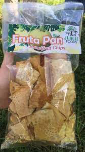
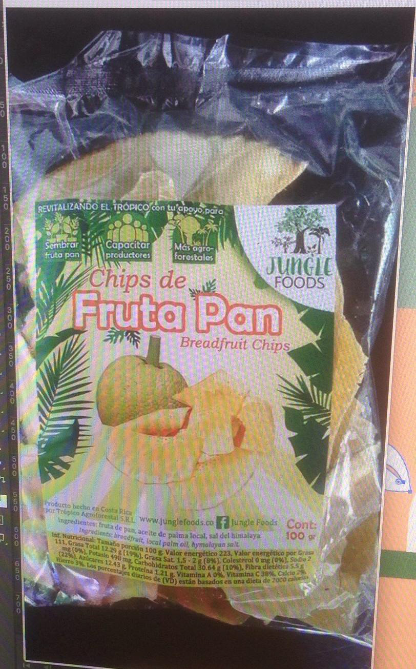
The current packaging design used by the company is non-recyclable plastic with very old branding displaying the product. We had to investigate and explore eco-friendly packaging to export the product considering the company's budget and manufacturing time for the bought bulk.

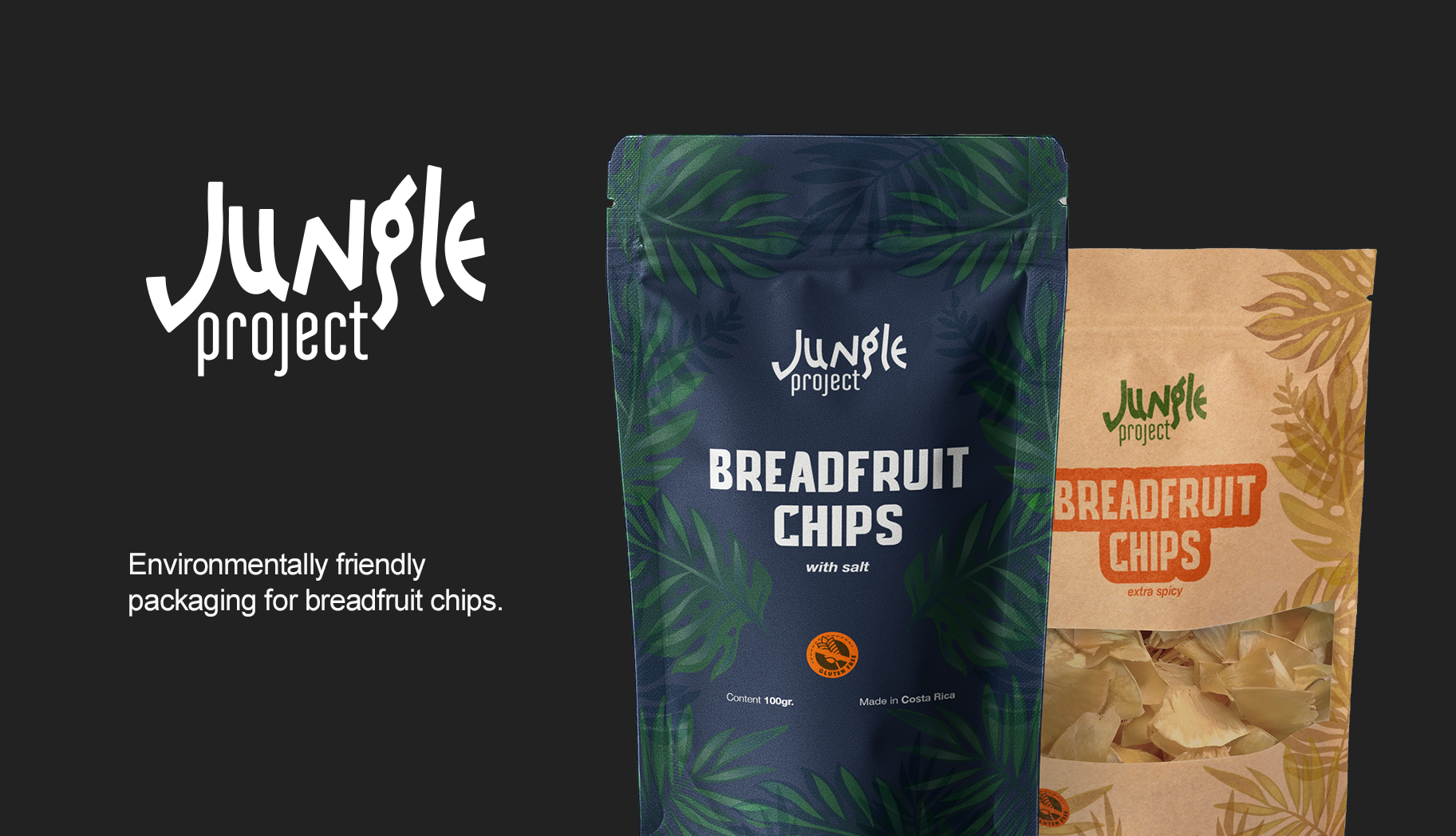
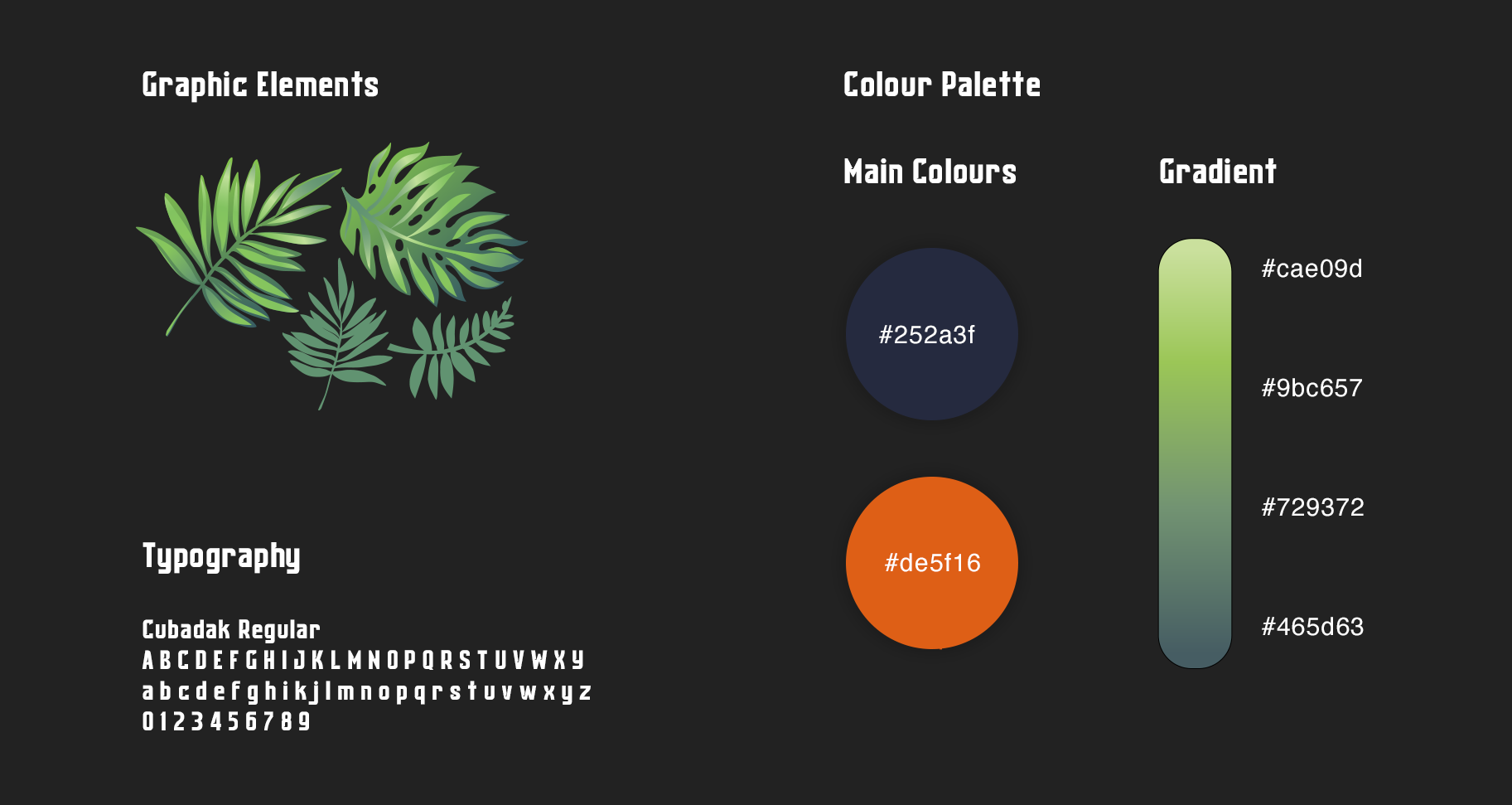
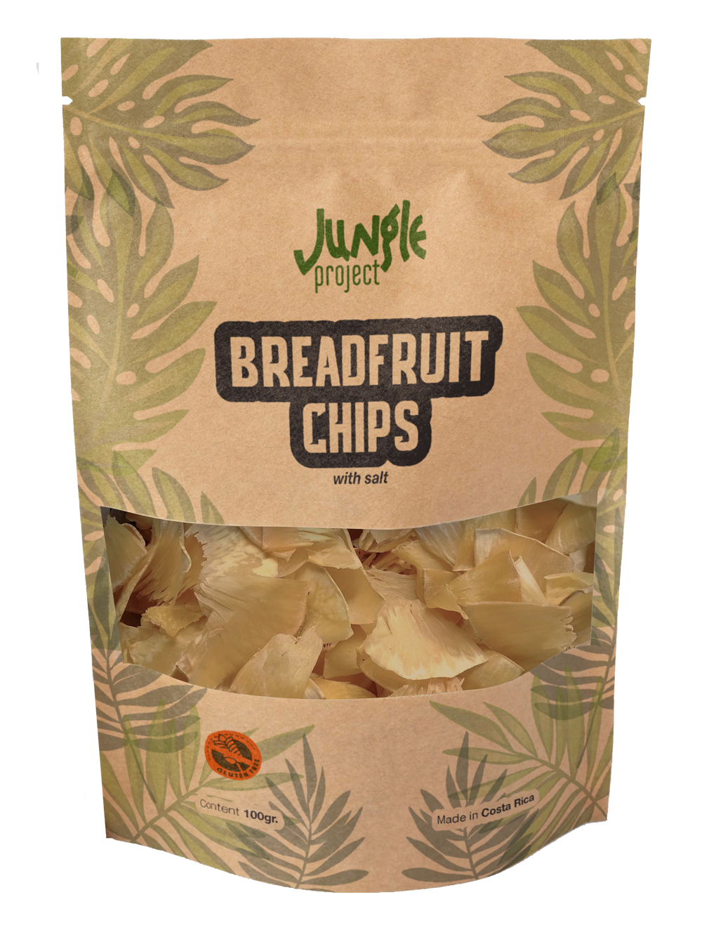
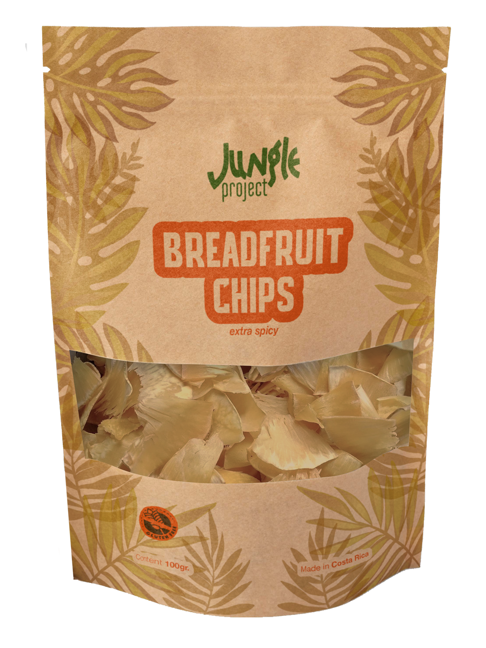
The design considerations for the pattern were to expand the jungle visual concept, recreating traditional tropical jungle leaves. The typeface selection played the breadfruit chips cuts and textures.
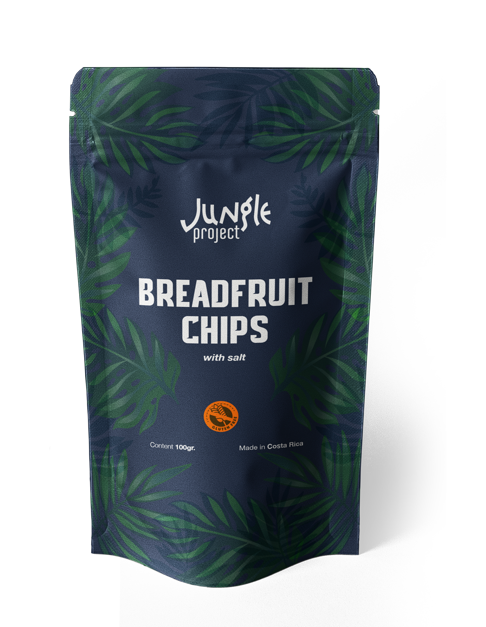
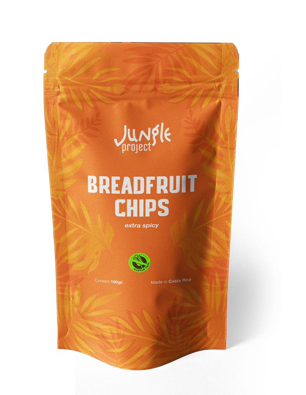
For the colour palette, we consider two variations to differentiate the two flavours handled by the company: breadfruit with salt, following greens and clues colour palette; breadfruit extra spicy following yellows and oranges palette.
For the colour palette, we consider two variations to differentiate the two flavours handled by the company: breadfruit with salt, following greens and clues colour palette; breadfruit extra spicy following yellows and oranges palette.
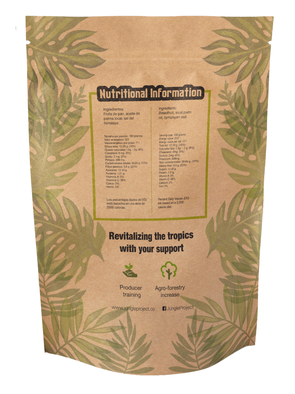
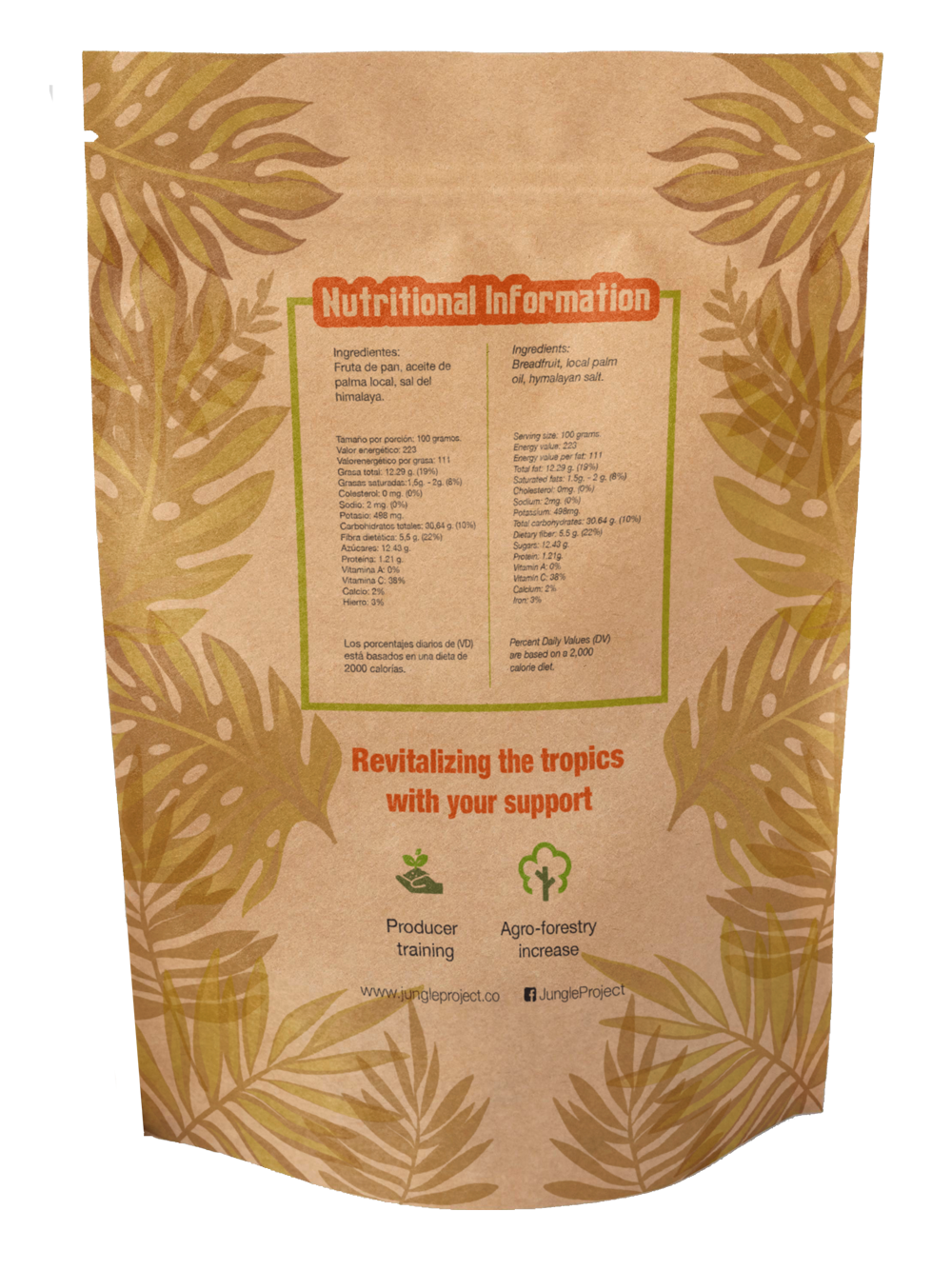
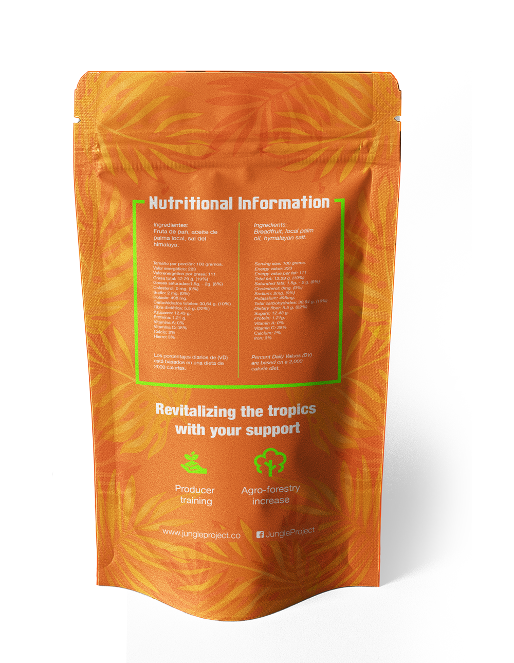
We develop two environmentally friendly possibilities. The first is a lined-kraft sachet pouch envelope with a reclosable zipper design and a cutout in the bag's lower part. Its back maintains the leaf design and discloses nutritional information and other information of interest.
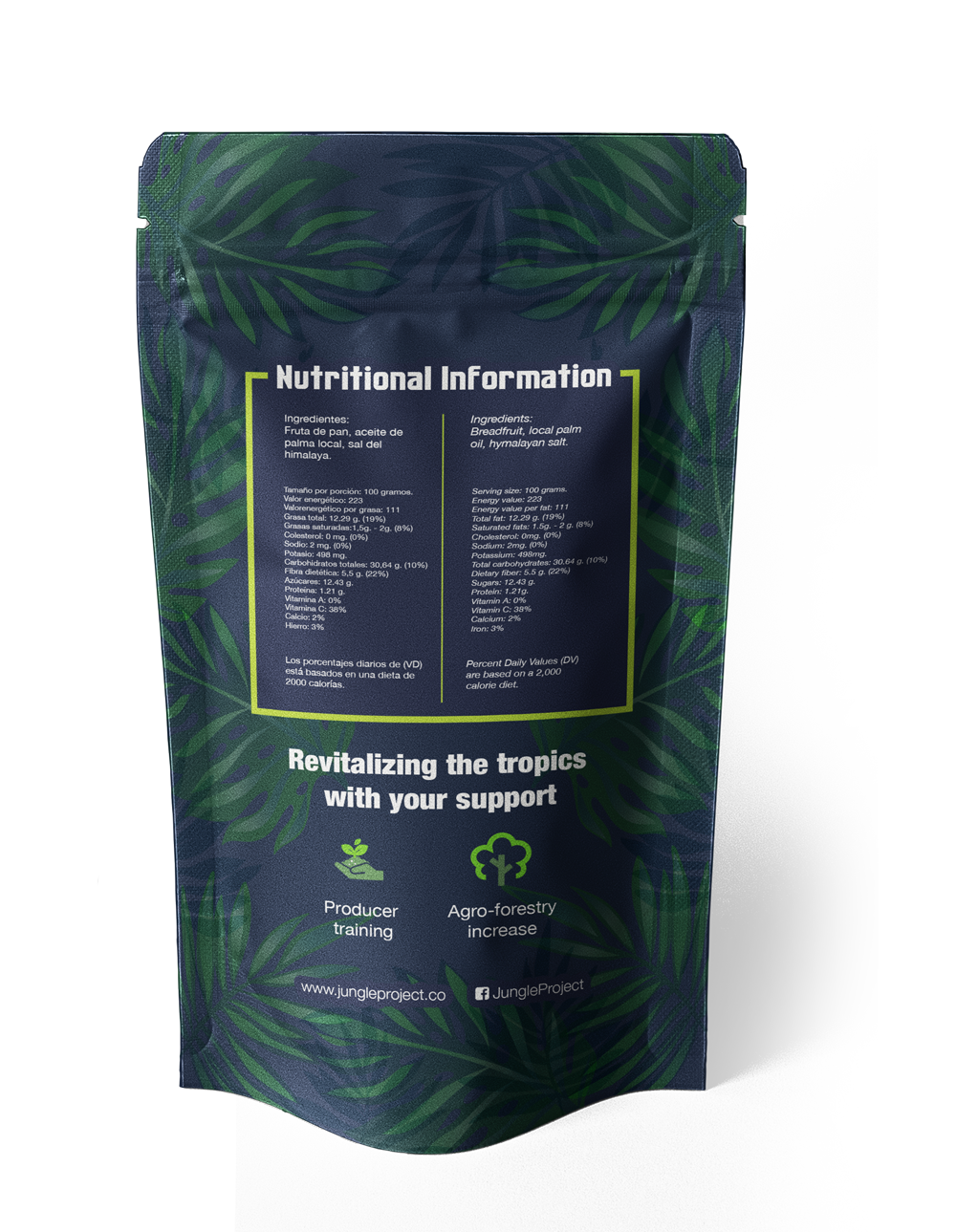
The second option design was a sachet pouch envelope with a reclosable zipper and a glossy surface effect, a full bleed print without cutout windows and a brighter design. This option was thought for a more high-end target. Once again, the packaging's back maintains the leaf design and discloses nutritional information and other information of interest.
The project was worked in Adobe Photoshop and Illustrator and sold to the client for an estimated CAD$4370.82. If you want to know or even support the project and the relationship with local farmers of breadfruit, follow Jungle Project on social media or visit their website www.jungleproject.com.